
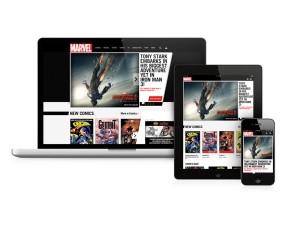

This week, Marvel launched a boldly redesigned responsive homepage, with a layout that automatically resizes and optimizes for any screen or device: desktop, smartphone or tablet. With Marvel’s audience utilizing mobile and tablet devices more than ever, this will improve the Marvel.com user experience exponentially.
“More and more people are accessing Marvel.com from mobile devices,” says Kristin Vincent, Marvel VP of Product. “We want them to have a great experience, whether they’re in a store on their phone or sitting on a couch with an iPad.”
You can sample the responsive nature of the new Marvel.com homepage on your iPhone, iPad or Android device, or just grab the corner of your browser on your desktop and resize to see the various layouts.
Touch it, swipe it, turn it on its side—the new site is completely flexible. This is yet another example of how Marvel is blazing the trail, this time in digital using cutting edge technology.
“It’s not just about using the latest technology, it’s about making it easier for Marvel fans to find what they’re looking for,” continues Vincent. “And as we roll this new design out to the rest of the site, we’ll be adding some new features we’re really excited about, so people should check back.”
This new, bold, modern design provides only a sneak peek of what’s to come. In the coming months, all of the major sections of Marvel.com will be re-launched with the new visual design and to support mobile/tablet devices.
Experience the new Marvel.com homepage today and get ready as Marvel continues to lead the digital ReEvolution into 2013 and beyond!