
DC Comics releases another Batman series, but this time we get a comic that focuses on a traditional coloring for comics which is Batman Black and White on its second issue. 
Of all comics that I’ve reviewed so far, from color to black and white, we get this comic series which is monochrome in the same way that people do in traditional comic coloring media back then and manga. So there are a lot of comics that were focused to color black and white that way, and then DC Comics decided to make a filler arc that can have a coloring media in black and white, interesting. The comic is created by Bob Kane and Bill Finger. Both of them are writers and artists who actually worked together to make this comic. But this time, this comic is another one of the comics created by different various writers and artists who adore the Batman series.
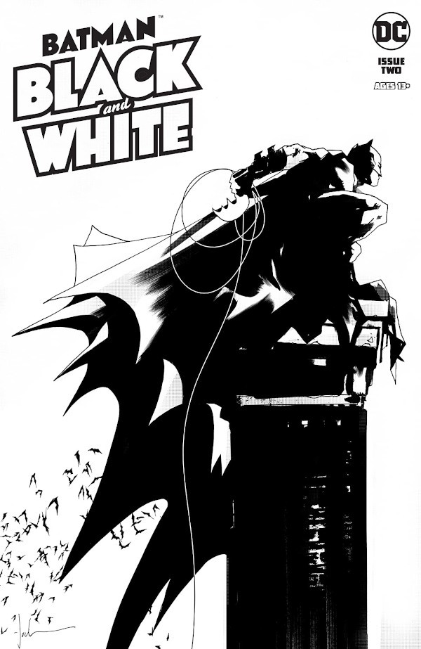
The front cover shows an absolute illustration of Batman in black and white, this is more likely to have all that inking on a bristol paper or Clip Studio Paint. The fact that it was drawn that way is that most of the artists are comfortable to color comics in black and white as finishing touches. The vector lines of his cape have contained in a speed point form by using a pen. And somehow the artist has used some kind of gradient patterns to put some dots on the cape and the chimney.
So there are different kinds of art styles with that different kind of coloring that they feel comfortable off, it actually makes more sense than artists are doing this. Oh my god, I’ve been wasting my time deciding if I want to color my comic or not, but THIS comic, this comic shows me the true way. Believe it or not, Batman Black and White makes more sense than any other comics that actually colored that way, same does with the manga where every series are published in black and white, and it was a phenomenon and it still keeps going that way. So this time, instead of going around with the story of this issue, I want to talk about the art style and the medium that the artists chose to ink the whole thing.
The first comic, illustrated by Mitch Gerads, intended to have 9 panels on every page and colored in a monochromic form, which would mean that he switched the color medium from color to black and white because he has completely colored them and switched in a grayscale form. Nothing special, but it’s kind of realistic to have it in this comic. The second comic is illustrated and written by Sophie Campbell, the first thing that she has done is that her comic is completely drawn in ink and this is the perfect example to have what black and white comics truly look like. From the start of the story, the artist started to color Catwoman’s suit black, then after a few pages, she met a white cat that made her put her Catwoman suit in white. That basically is a study between positive and negative space that is coming from this comic. And the other black and white comic that is more interesting is an artist named Dustin Weaver. What he drew on this comic made a lot of details around every page of the comic. That is almost reminded me of Berserk, except that this comic shows a lot of scenes of a white Batman who happens to be an impostor of Bruce Wayne. The difference between the two Batmans is that the artist tends to have some details over the coloring of the characters, it the same setting as Sophie’s comic except that Catwoman changes the color of her catsuit. Aside from the perspective and the cityscape environment, the characters seemed to have a different interaction when they first met themselves. From the first thing whenever I saw the facial details between the Batmen, Bruce seems to be more of a healthy human being, while the other one looks like shit, almost looked like a degenerate old man. Even so, whenever when I look at the characters it looks like the artist focused on the human anatomy of the face and the details. Also, the cityscape of Gotham kind of reminds me of all the places that I double-crossed my eyes whenever I venture through the city and it seemed too real and illustrated well.
So after going through with this comic in black and white, I find it more to be understandable the difference when the artist chooses to have the whole comic in color or black and white. It gets the idea of how much time you’ve developed while painting. Of course, I read a lot of manga in my teenage years and somehow artists chose their different types of art styles and mediums just to make the comic clearer for the readers. Aside from Dragon Ball or One Piece, there’s one manga that made the whole comic progress more understandable and clearer for the reader, and that is that Dragon Quest manga, where a twelve-year-old who ventured as a Hero to annihilate the demon army with his companions and stuff after his mentor who looked like one of the renaissance artists, died who was also the Hero. It was illustrated by Koji Inada, and his art style is similar to Akira Toriyama, because he’s the one who draws the characters for that game, but on that manga series, whenever I looked at the pages, the details and the inking were stunning which would make it more of a Dragon Ball material. And on the other chapters of the story, the artist tends to use monochrome colors right after he colored them for some comic magazine, the details are more in contrast. And coming back to this comic is a journey to me to learn something about color theory and black and white. It’s more than anything to understand the medium of what the artist uses to color the comic pages.