“Single drops of water can erode mountains, my friend. One Man can defeat the wills of many.”
The on going saga of Bryan Hitch’s JLA Rao epic continues.The story begins where it left off on the ancient ship of Rao, where The Flash (Barry) is helping scientists and archeologists escape, meanwhile in the past of ancient Krypton Hal Jordan is unable to use his ring and is in prison. Young Rao is ashamed of his Future counterpart for the crimes he’s committing in the present day while simultaneously committing crimes in the past as well. Rao’s chaotic influence and destruction have laid severe damage to the citizens of earth’s wake.
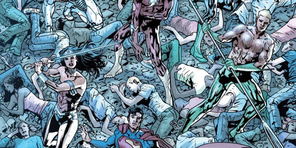
The whole comic is generally focused on the League finding a way to regroup despite being battered, beaten and nearly broken. There are some moments in the book that are great, of course, it’s action packed , but this specific issue was actually calmer than the issues prior in this series thus far. Despite the series having massive delays , it’s still holding up its narrative of the dangers of one being consumed by their own accolades and power . Or when people fall under ideologies or theologies that can do more destruction than good, Or the usual, uniting with like Minded individuals for a common cause for the betterment, safety, and equality of all people. Either of those narratives can be applied or leave an impression to the reader depending on how they approach the series beyond all the boom bam art.
In terms of art , I’m a general fan of Bryan Hitch. I loved his work on JLA back in the early 2000’s run with Mark Waid . So it’s great to see that he’s still able to draw the way he does. Now it’s not Ultimates Level good, but it’s still pretty damn Great. Note, Bryan Hitch is known for modeling illustrations of protagonists and Antagonists after actors and actresses in the same way he and Mark Millar approached it in their Ultimates run. Batman has the Nolan styled cowl, on page 14 The Flash has some Grant Gustin aesthetic on the 6th panel and on the last page, Green Lantern looked like Chris Pine (which would have been great since he would have fit that role for the DCEU if he wasn’t playing Steve Trevor that is). I actually had a chuckle to myself when I realized that Pulp Fiction John Travolta is who Rao reminded me of. Which was pretty cool. Every illustrative artist for the most part always has a reference for the idealized interpretations of characters that they are drawing.
I’ll admit, Bryan Hitch has a terrible track record when it comes to deadlines, but it’s all forgiven once you see the finished art work. I’ve had a friend who once told me, it’s best to master one thing, then try to do everything at once. Because you’ll never be good at everything because it’ll never stack up to the level as the one thing you have mastered. In that respect, Hitch is a great illustrator, and his Writing isn’t bad neither. But for him , there is a reason why he had to be a writer instead of an illustrator on the new Justice League series because song all that work as one person can Burn you the hell out. Heck, you can see that with Frank Miller, or McFarlane, or any other illustrator /writer-illustrator . Focusing on writing and art will either cause the writing to suffer or the art . But that’s just a personal thing I wanted to throw out there.
The inking by Daniel Henriques does a good job at keeping up with Hitch’s artwork. It’s able to cement weight and levity where it’s needed and is very tight to the pencils. Alex Sinclair is closely associated with Jim Lee when it comes to coloring, does nothing short but delights the reader’s eyes. Sinclair’s coloring throughout the series by far is one of the series stronger cornerstones.
With rumors that the series would be canceled , then un-canceled , to double canceled to un-canceled by the 2nd power , I really hope the series really gets its proper conclusion with issues 10, 11 &12. Since the Rebirth line has already started, Hitch has already started writing the Justice League title 3 issues in. I just hope that the readers who’ve been reading this from the start get to see the proper conclusion instead of a random cancellation.
Complaints: Green Lantern’s text bubbles can be very difficult to read digitally due to the color choice. A very bright green box coloring mixing with a lime green text doesn’t read well since the reader would have to zoom in to really see what Hal is thinking . But I know it reads better in physical copies rather than digital when it comes to reading certain character texts . Overall, it’s a fine read.