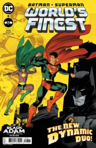
Metropolis is under the threat of The Key as he instills fear throughout the city. Batman and Superman must save the city while simultaneously training David to control his powers under strenuous circumstances, this being one of them! 
Can David control his powers enough to save some of the inhabitants without inadvertently endangering them? What is David hiding from the heroes? And What does the Key want with Metropolis?
This was a fun-filled issue that continues to drive home why Batman and Superman are considered the World’s Finest superheroes in all of comicdom and literature. His portrayal of these characters, how they communicate as brothers in arms despite their unique differences as they try to stop the Key, is a highlight of this series. Most of all, how they interact with their cast of characters and sidekicks such as Robin (Grayson) and Supergirl, there is a real sense of family, especially when Batman and Robin work together in a healthy way, subtly displaying the kind of father/son dynamic that isn’t often seen these days whenever any other iteration of Batman and Robin is involved. How Waid handles Batman and Superman’s interaction with the mysteriously superpowered David, be it integrating him with the Titans, or helping him to hone his abilities under strenuous circumstances, it reminds me what most superhero books in 2022 often lack, which is hope.
Dan Mora continues to illustrate this series with gorgeously stylized illustrative work. His layouts are great, but it’s his rendering and gestural work of the characters as they move through the panels, and his use of chromatic values that give three-dimensional life to these two-dimensional illustrations. His art just exudes enthusiasm and a lush style that displays why Superman and Batman are visually iconic while maintaining the design choices that he consistently illustrates on each page. But I have to admit, what really makes this book sing beautifully aside from Mora’s art or Steve Wands lettering is Tamra Bonvillan’s coloring. Bonvillan’s coloring is sublime. There’s a nice balance between the use of flat color renderings that feel retro yet current with a color palette that is vibrant, eye-catching, and lively while being simply flat in all the right ways. Personally, I was obsessed over the color choices, and couldn’t help but compare it to John Higgins’ work on Batman: The Killing Joke and Watchmen. It’s the use of color that really sets this book apart from other mainstream superhero titles and is one of the reasons why you should add this to your pull list for new comic book day.

