
DC Comics brings you a Superman comic which now will bring you only red and blue colored comic in Superman Red and Blue on its first issue. 
And no don’t expect me to go over with the Pokemon Red and Blue shit. But this comic is only focused on coloring only red and blue from the cover art the whole pages, which makes a lot of sense to readers so far. So COUNT YOUR BLESSINGS DC COMICS! So DC tends to bring out comics that only use some primary color, the last comic that I reviewed involves the focus of inking which is Batman Black and White, and that was the more proof that I need to study color theory. This comic however makes you think that you’re still drafting the comic by using blue and red colored pencils. This comic is created by so many various writers and artist who are looking forward to having their separate stories apart, but I am only here to explain how the artists use the primary colors to have this color only red and blue, I’m sorry that there’s no yellow, I don’t even know what to call a primary color without a yellow color.
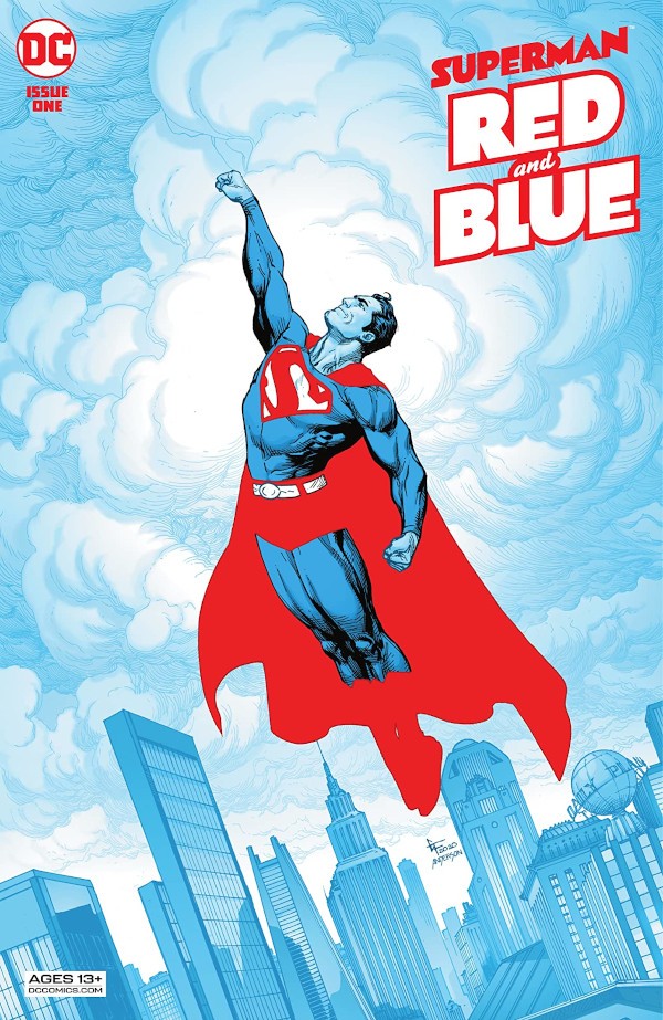
The first front cover shows that it was done by some graphic designer, even he illustrated the whole cityscape in a blue sky. Think about it, if you ever have your eye crossed over the page, you might hallucinate and think that you’ve done this draft. Then there’s Superman which only the blue side, the artist focused only on the line art, but the cape and his super boxer are all red and didn’t bother to add a black line art. The second cover art shows something that is coming from Yoshitaka Amano’s illustration of Superman, oh wait. Oh my god, that second cover art IS ILLUSTRATED BY YOSHITAKA AMANO. I just can’t believe my eyes, and here I thought it was some other artist who has an art style that is similar to him. But anyway, Amano just illustrated Superman which is more like Firion from Final Fantasy II, but more importantly the way Superman poses, he poses like the Onion Knight from Final Fantasy III which is the warrior with the blue cape and white hair wielding two swords. Well, he’s not only that he illustrated Final Fantasy but he’s actually the character designer to design Vampire Hunter D, one of the Tatsunoko titles, Superman, some illustrated magazines, and such. I’m sorry, but man fuck these other cover artists of this comic because that illustration made my very day that I see this piece from a famous artist in Japan. Please excuse my language.
So the first one is actually “Untitled”, aka “I can’t decide what to call this shit” cliché, illustrated by Clayton and colored by Jordie Bellaire. From the get-go, the following comic panels are monochrome, only focused on one color, but since this comic is Red and Blue, so why not. The artist handled the line art by having red and blue color on the background while he drew a line art of Clark in black. However, the artist and the colorist just made these pages so well and easier to read. From what I can see the illustrations are more precise because the artist focused on the inking by using red and for that, it shows much more than I see comics in black and white. I do wonder if my theory is that artists use primary colors to have this comic much more sense to readers or to have it in black and white for manga?
The second comic is illustrated by Steve Lieber and colored by Ron Chan. The first thing that I’ve witnessed is that the colorist uses red and blue acrylic colors and the use of graphic design to color the background as well. The characters seem to be showing so much emotion since some family just died, the mother is injecting herself with drugs, and her son was terrified from that.
I’m skipping up ahead to a comic called “The School of Hard Knock-Knock Jokes”, written by Marguerite Bennett and illustrated by Jill Thompson. And to be honest this comic makes readers scratch their heads about it, and it’s about Clark’s first day of kindergarten. It’s rare to see this comic out of a crackhead’s head. And the reason for Clark making friends with the children is *sigh* KNOCK-KNOCK JOKES. So the coloring, first of all, it didn’t seem that the artist made anything Red and Blue, but she focused on filling numbers of shades and contrast coming, painted in watercolor or acrylics. The background seems that she comes up by shading some shades of gray by using a grayscale. Somebody tell me about her art style, I’m more confused than anyone else here.
After going through the study of color from this comic, it seems that some of the artists focused on coloring the whole comic in red and blue and some of them thinks that they didn’t like it. I don’t know what’s the deal, one of the comics is black and white and at the end, the artist colored one of the pages red and blue, and the next page together. What sense does that make? Well anyway, this collaboration comic is actually great for collectors and those who want to study and experiment with color much more like Batman Black and White comics.